Wednesday, November 14, 2012
Our Trip
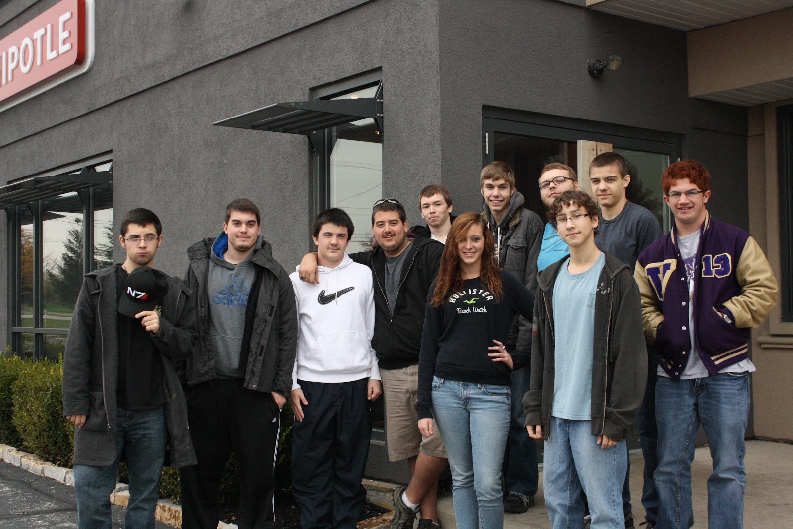
Pictures from our class Field Trip! I hope you all enjoyed your day out of school-I had a good time with you all. Here are some pictures from our fun day:
Maybe this one is a little better angle for you Charlie.......
Tuesday, November 13, 2012
Camera angles/shots
Click here to see: 40 photos that show emotion
Click here to see: Emotions in relation to Body Language
Camera Shots
A camera shot is the amount of space that is seen in one shot or frame. They demonstrate different aspects of a film's setting, characters and themes. As a result, camera shots are very important in shaping meaning in a film.
An extreme long shot contains a large amount of landscape. It is often used at the beginning of a scene or a film to establish general location (setting). This is also known as an establishing shot.
A long shot contains landscape but gives the viewer a more specific idea of setting. A long shot may show the viewers the building where the action will take place.
A full shot contains a complete view of the characters. From this shot, viewers can take in the costumes of characters and may also help to demonstrate the relationships between characters. For more information on costumes and acting refer to Chapter 4.
A mid shot contains the characters or a character from the waist up. From this shot, viewers can see the characters' faces more clearly as well as their interaction with other characters. This is also known as a social shot
A close-up contains just one character's face.
This enables viewers to understand the actor's emotions and also allows
them to feel empathy for the character. This is also known as a
personal shot.
An extreme close-up contains one part of a character's face
or other object. This technique is quite common in horror films,
particularly the example above. This type of shot creates an intense
mood and provides interaction between the audience and the viewer.When analysing a film you should always think about the different camera shots and why they are being used. The next time that you are at the cinema or watching television see what camera shots are being used.
Camera angles
It is important that you do not confuse camera angles and camera shots. Camera shots are used to demonstrate different aspects of setting, themes and characters. Camera angles are used to position the viewer so that they can understand the relationships between the characters. These are very important for shaping meaning in film as well as in other visual texts.The following examples will help you to understand the differences between the different camera angles
A bird's eye angle is an angle that looks directly down upon a scene. This angle is often used as an establishing angle, along with an extreme long shot, to establish setting.
A high angle is a camera angle that looks down upon a subject.
A character shot with a high angle will look vulnerable or small. These
angles are often used to demonstrate to the audience a perspective of a
particular character. The example above demonstrates to us the
perspective or point of view of a vampire. As a viewer we can understand
that the vampire feels powerful.An eye-level angle puts the audience on an equal footing with the character/s. This is the most commonly used angle in most films as it allows the viewers to feel comfortable with the characters.
A low angle is a camera angle that looks up at a character. This is the opposite of a high angle and makes a character look more powerful. This can make the audience feel vulnerable and small by looking up at the character. This can help the responder feel empathy if they are viewing the frame from another character's point of view.
As with camera shots, you will be able to see many examples of camera angles in any film or visual text that you view. The next time that you watch television or see a film, take note of the camera angles and think of how they affect your perception (idea) of different characters.
Another camera angle that you might come across is a Dutch angle.
A Dutch angle is used to demonstrate the confusion of a character. The example above should disorientate you.
Field Trip!
Today is the big day for us to venture out of the classroom and see our first movie on the BIG SCREEN. I'm really looking forward to the movie and taking you all on a field trip. You are such a GREAT group of students and deserve a fun trip out of the classroom. We have a lot of hard work ahead of us in the next few weeks-so remember this day when you are not so happy with me:)
HERE WE COME WRECK IT RALPH!
Story
As soon as you finish your stories please drop them in my drop box. Come see me if you see this before school ends and you are free. I will be here until 3:30 today.
DON'T FORGET THE DETAILS! THIS WILL HELP YOU IN THE NEXT STEP!
Sunday, November 11, 2012
Bringing Creativity to your work
Yearbook Cover/Backcover Designs are due to me by Friday!
This is something you will have to work on at home for the most part. You may have some time to work on finishing touches in class on Thursday. This is worth 25 points. Everyone needs to bring $4.25 for the movie on Wednesday, and lunch money if you plan to eat.
What is she trying to convey in these pictures-break it down picture for picture?
How do you personally feel when you look at these pictures?
What do you think is going to happen next(from picture to picture or in the end)?
What do you think happened prior to these photos?
How do the angels effect your perception?
If you could ask the Artist anything about her pictures what would your
question(s) be?----So what would you want to know?
Self-Reflection : All about YOU!
We are now going to get personal. I want you to go to a place that is going to take you out of your comfort zone-it can be hard for people to talk about themselves and tell stories from their past, but we need to get personal in order to move forward with this assignment. This is a personal reflection journal that you are going to writ
1.Make a list of words that describe who your are-your personality: (try to think of 10-15 words)
EX: outgoing, enthusiastic, passionate, leader.............
2.Now make a list of words that describe how you think others perceive you or the way you want others to perceive you:
3.Now I want you to think about the one word that you feel describes you most or the one word that you want or think people perceive you as the most. OR choose a word that describes an important part of your life and reflects your personality at that moment. I now want you to think about a story in your life that could explain/describe or showcase you in that particular way (This story should be personal, it could be a little weird or even scary). Choose something that you typically wouldn't share with anyone else (an important part of your life). Now you are going to write that story down on paper in full detail. I want as many details as you can think of in your paper. Write as if you are talking out loud to someone you feel comfortable talking to (like your best friend). I'm not grading you on grammar, but on content and detail(length). In this story there should be a clear description of your emotions that you have gone through with a distinct Beginning, Middle and End. I WANT DETAILS!
MY STORY.....................................................ok, so you got it after all, I thought you would all forget:) It's nice to see your interest. I hope my story inspired you to dig deeper and get personal with me, and ultimately in turn your own art.
MAKE IT PERSONAL and you will make an impact that others will remember, play it safe and you will be forgotten!
Your stories are DUE on Wednesday and I will meet with each of you one on one to discuss them and talk about your vision for the assignment. So if you have it done early, feel free to turn it in. On Tuesday you will have time to write your story IN DETAIL.
Wednesday, November 7, 2012
Yearbook Competition
Today and tomorrow you can also work on the Yearbook
cover/Back cover. Keep in mind you need to be working on your Copilots too. You may have to work on some things at home. The yearbook is worth a 50 point grade for
me. I have listed a bunch of important things about creating a graphic design layout. Please read through all of them. In order to make it a good
composition you need to remember the following:
HOW CAN YOUR DESIGN BE DIFFERENT THEN ANYTHING YOU HAVE EVER SEEN BEFORE?
You may already know a lot of these things, but please read through them all. I added lots of other important information. Thanks guys:)
1. Unclutter/clean area-
Think about how you want your area to look. Do you want to have everything in line and neat looking? You need to have a master plan, you can not go at this blindly. (look up other yearbook ideas on the internet and see what you can use/borrow from other designs-it's not cheating, it's borrowing ideas)
2. Balance- Sometimes it is nice to have some blank white space in a layout, but too much white space is not interesting.
3. Think about dividing the page into thirds-you will have more visual appeal (rule of thirds)
5.Think about your color choice. And your text choice-remember no more then 2 texts per page design layout. I would probably stick with 1 for this assignment (All text needs to show effects, it will make it pop and look more interesting).
6. What kind of photo or image do you want to have and will you draw it out, take a picture yourself or draw it out in Photoshop? Think about how you want to lay this out. (example:Lasso, clone, square border with drop shadows, etc.) You need to think about this before you begin.
7. Think about size relationships. You do not want everything to be the same size, so what is going to be the largest and smallest? Think this through and experiment with it.
See you all on Monday,
Have a good weekend and I hope you can get some filming for the Horror Film done.
Mrs. Schneid
You may already know a lot of these things, but please read through them all. I added lots of other important information. Thanks guys:)
1. Unclutter/clean area-
Think about how you want your area to look. Do you want to have everything in line and neat looking? You need to have a master plan, you can not go at this blindly. (look up other yearbook ideas on the internet and see what you can use/borrow from other designs-it's not cheating, it's borrowing ideas)
2. Balance- Sometimes it is nice to have some blank white space in a layout, but too much white space is not interesting.
3. Think about dividing the page into thirds-you will have more visual appeal (rule of thirds)
4.Think about using 2 or more of the same design elements (example: if you decide to use circles as part of your background, use multiple circle design elements)
- most important elements spaced more or less evenly within vertical or horizontal thirds
- most important elements concentrated in the upper or lower third of the page
- most important elements centered on one of the points where lines intersect after visually dividing the page into thirds horizontally and vertically
5.Think about your color choice. And your text choice-remember no more then 2 texts per page design layout. I would probably stick with 1 for this assignment (All text needs to show effects, it will make it pop and look more interesting).
6. What kind of photo or image do you want to have and will you draw it out, take a picture yourself or draw it out in Photoshop? Think about how you want to lay this out. (example:Lasso, clone, square border with drop shadows, etc.) You need to think about this before you begin.
7. Think about size relationships. You do not want everything to be the same size, so what is going to be the largest and smallest? Think this through and experiment with it.
If you have any questions or need anything you know all the different ways to contact me. I will have my computer on me-don't hesitate to let me know what is going on.
See you all on Monday,
Have a good weekend and I hope you can get some filming for the Horror Film done.
Mrs. Schneid
Sunday, November 4, 2012
This weeks Schedule
Here is a link to the Cavs intro that I shared with you last week. I have a link to share with you on Tuesday of what a beginning game looks like at the Cavs-Video courtesy of my friend Keith. And for anyone that wanted to look into his company it is called-Think Media Studio's and my friend is the LEAD EDITOR!
The Cavs Intro
Tuesday-Plan on filming the Secretary scene during class time.
Wednesday-Scott Dommin in for a presentation.
Thursday- Mrs. S is out-Plan on Working on Copilot 8.1 and some of you will be choreographing the bathroom fight scene for the Horror film.
Friday-Mrs. S is out- Watch Copilot 8.2-Sid will hook it up for everyone to watch. Click the link below Sid. THANKS SID:)-YOU ROCK!
And after school film the bathroom scene for the Horror film.
PLEASE PLAN TO BRING PROPS AND EQUIPMENT ACCORDING TO THE FILMING DAYS-MAVERICK AND CHARLIE, PLEASE RELAY THIS INFORMATION TO ANYONE INVOLVED.
Copilot #8: Part 2 on TITLES
http://www.videocopilot.net/basic/tutorials/08.Titles_02/
The Cavs Intro
Tuesday-Plan on filming the Secretary scene during class time.
Wednesday-Scott Dommin in for a presentation.
Thursday- Mrs. S is out-Plan on Working on Copilot 8.1 and some of you will be choreographing the bathroom fight scene for the Horror film.
Friday-Mrs. S is out- Watch Copilot 8.2-Sid will hook it up for everyone to watch. Click the link below Sid. THANKS SID:)-YOU ROCK!
And after school film the bathroom scene for the Horror film.
PLEASE PLAN TO BRING PROPS AND EQUIPMENT ACCORDING TO THE FILMING DAYS-MAVERICK AND CHARLIE, PLEASE RELAY THIS INFORMATION TO ANYONE INVOLVED.
Copilot #8: Part 2 on TITLES
http://www.videocopilot.net/basic/tutorials/08.Titles_02/
Subscribe to:
Posts (Atom)